Various logos for various clients
2012—2024
I have had the pleasure and privilege of designing logos for several brands – both well-known and new, big and small.
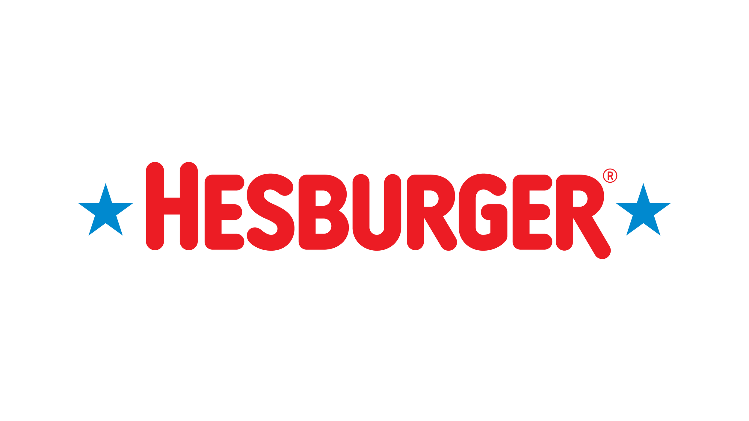
Hesburger logo facelift
2024
Hesburger’s well-known logo, iconic as it is, had plenty of flaws that reduced the perceived image of quality. I got to redraw the entire logo from a scratch, while carefully seeking to maintain the familiar look-and-feel, aimed for a more modern, sophisticated image.
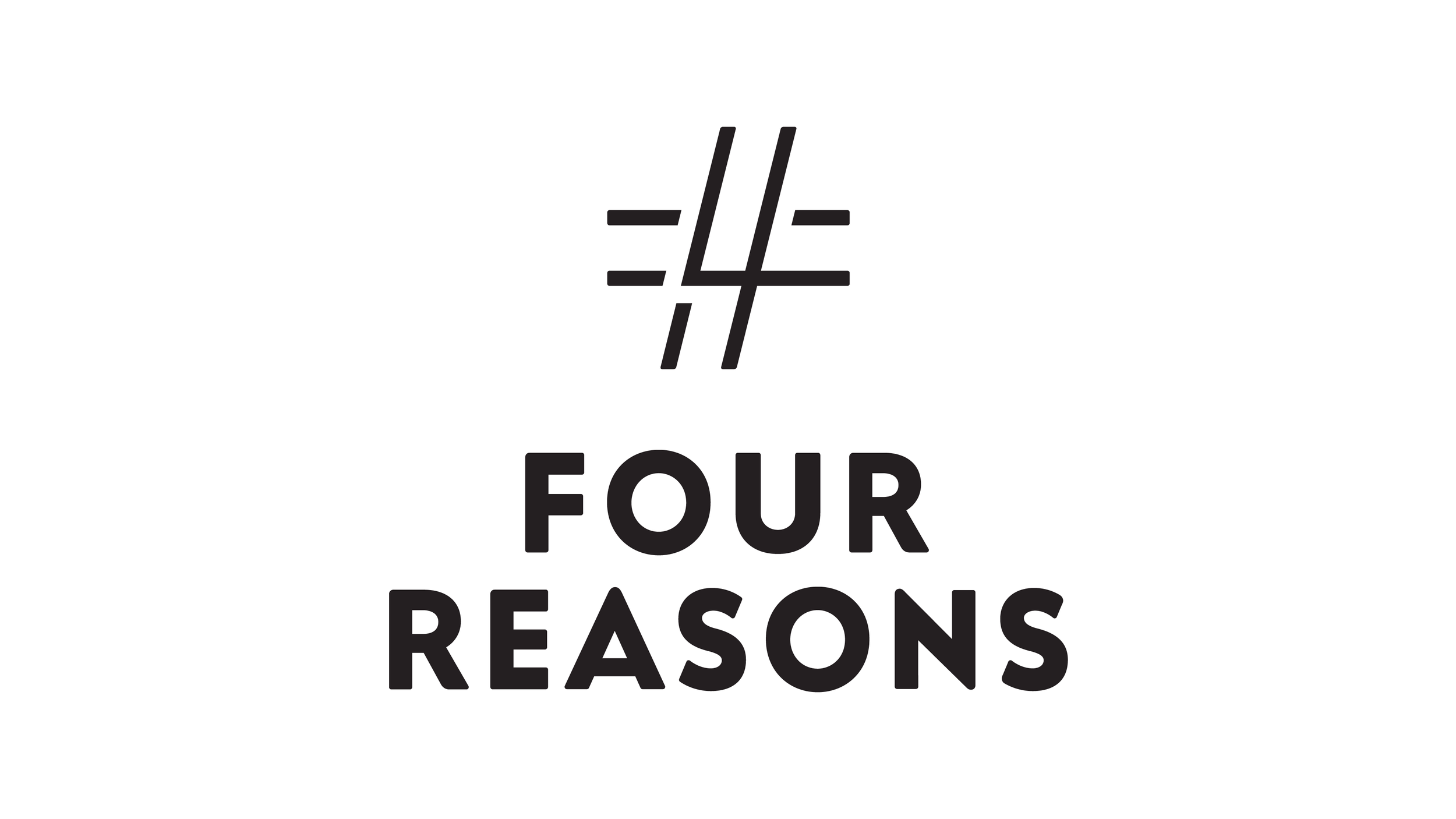
Four Reasons
Four Reasons revamped its entire brand and visual identity from 2018 to 2019. This included a whole new logo, centerpiece of which is the symbol picturing the idea of the four reasons behind the brand.
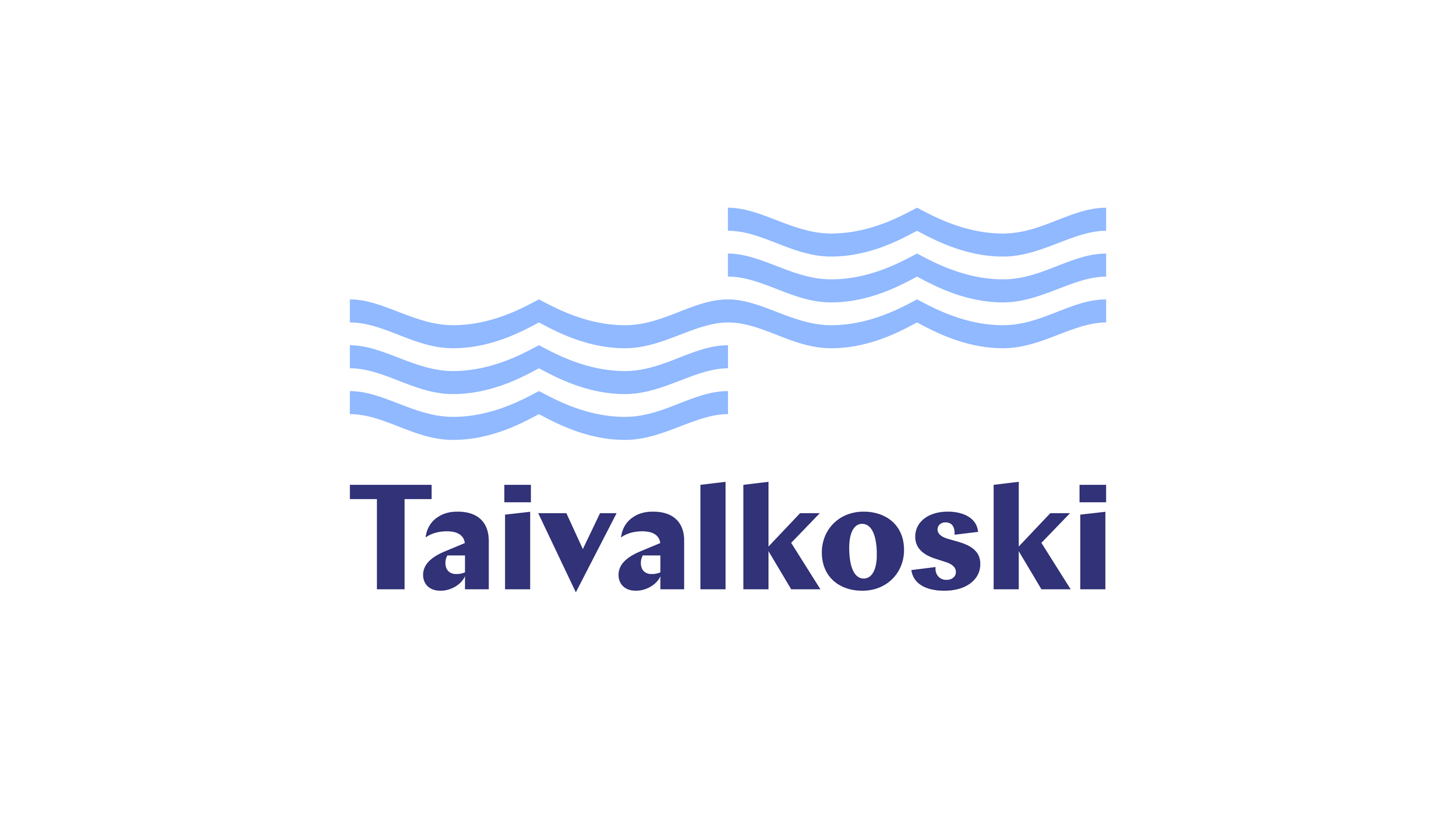
Taivalkoski
2023
Along with a visual identity renewal, the new Taivalkoski logo portrays the municipality’s landmark stream – as well as its cherished history as the home of beloved Finnish author, Kalle Päätalo.
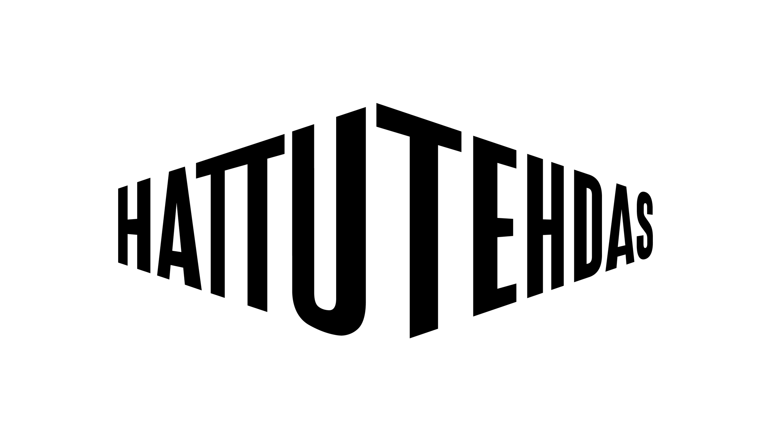
Hattutehdas
The monumental former hat factory building nowadays serves as a creative hub and space for many agencies and companies.
2022
2015
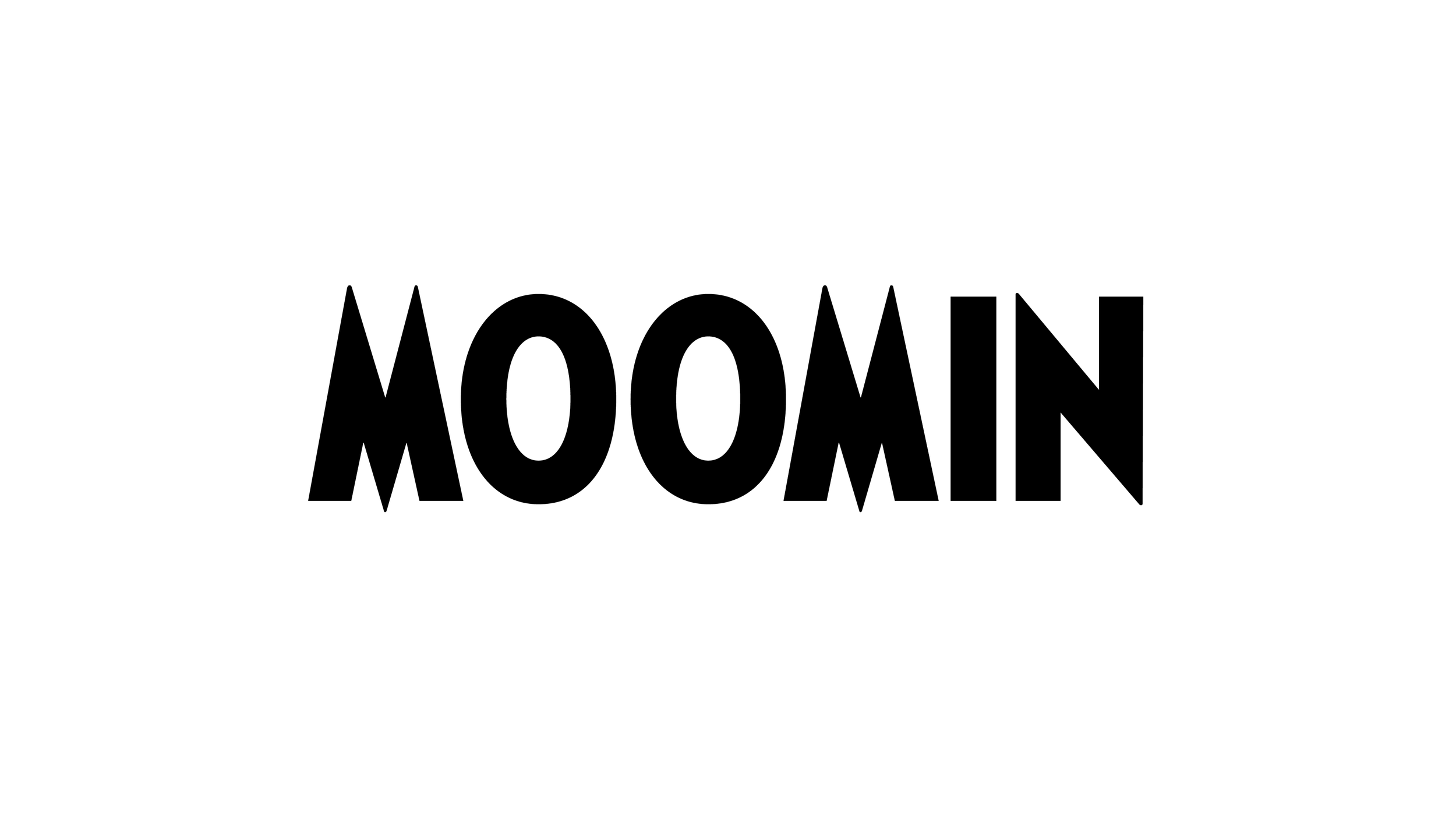
Moomin logo & font
Possibly the best Finnish export? Yes, it’s just typed with the font I’ve created – that’s just the point.
Do check the font case study.
2019
2019

